The Challenge
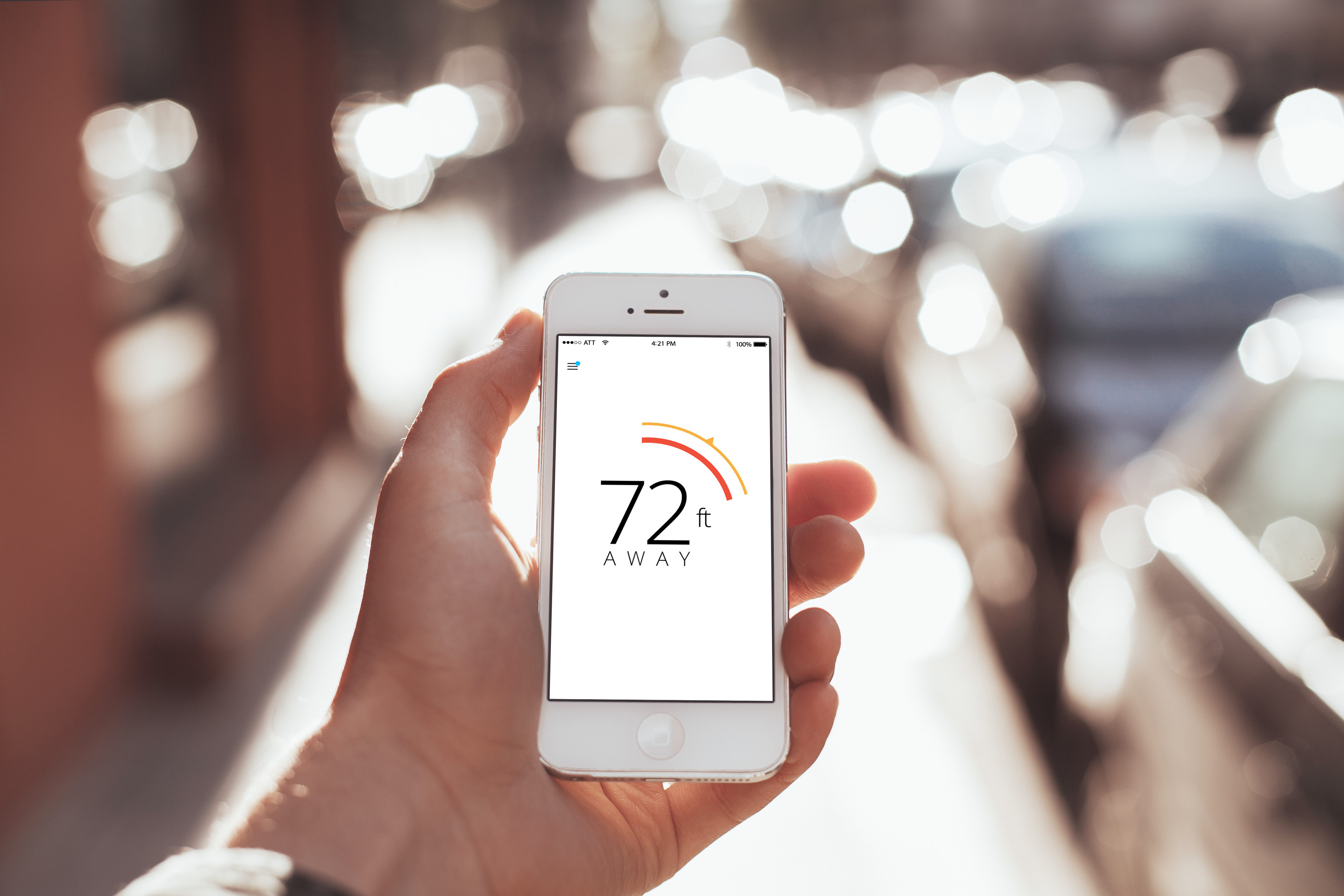
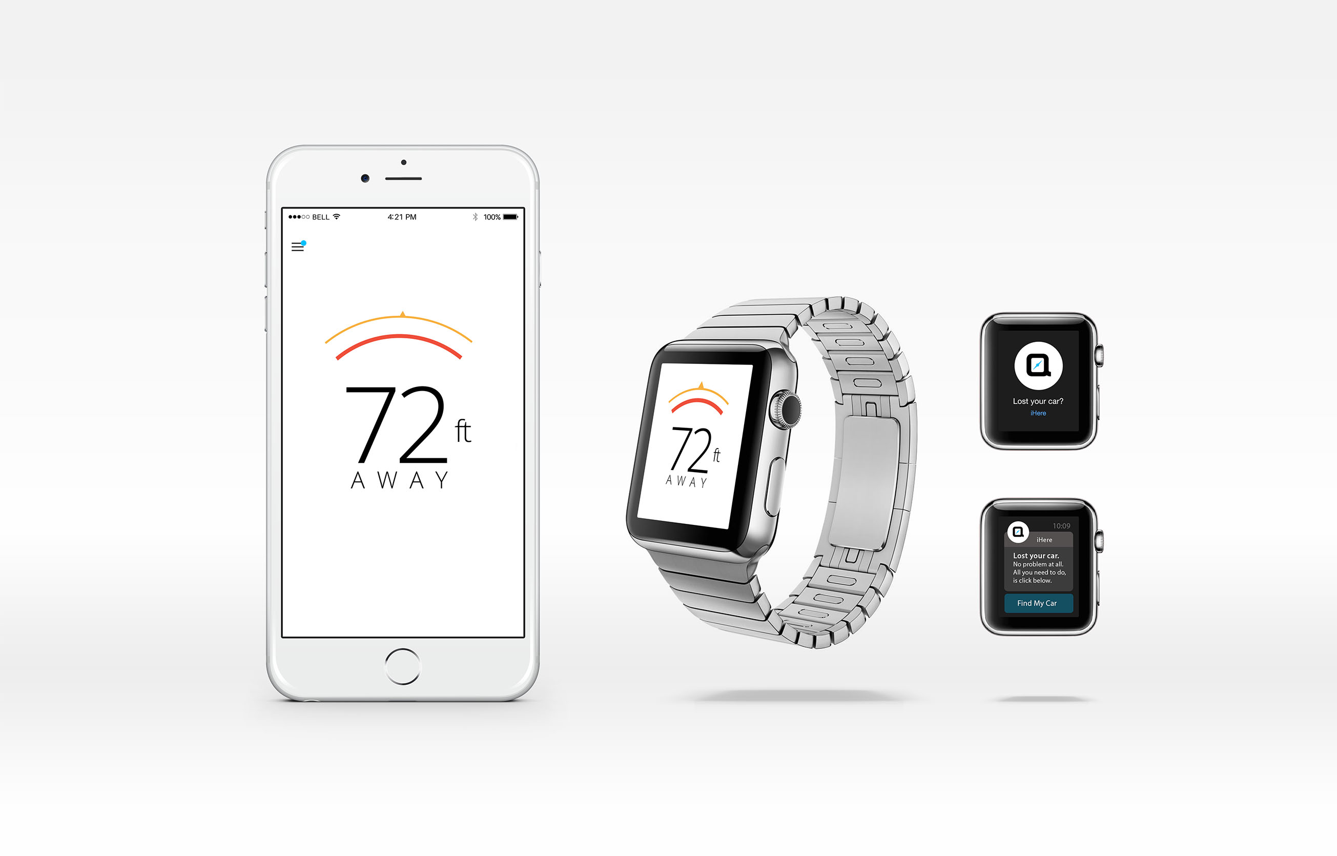
Nonda came to me to design an innovative and efficient way of tracking their customers stuff. The Nonda app will pair to their devices, via bluetooth in a signal radius up to a 75-foot. All this should be done in one click.
Solution
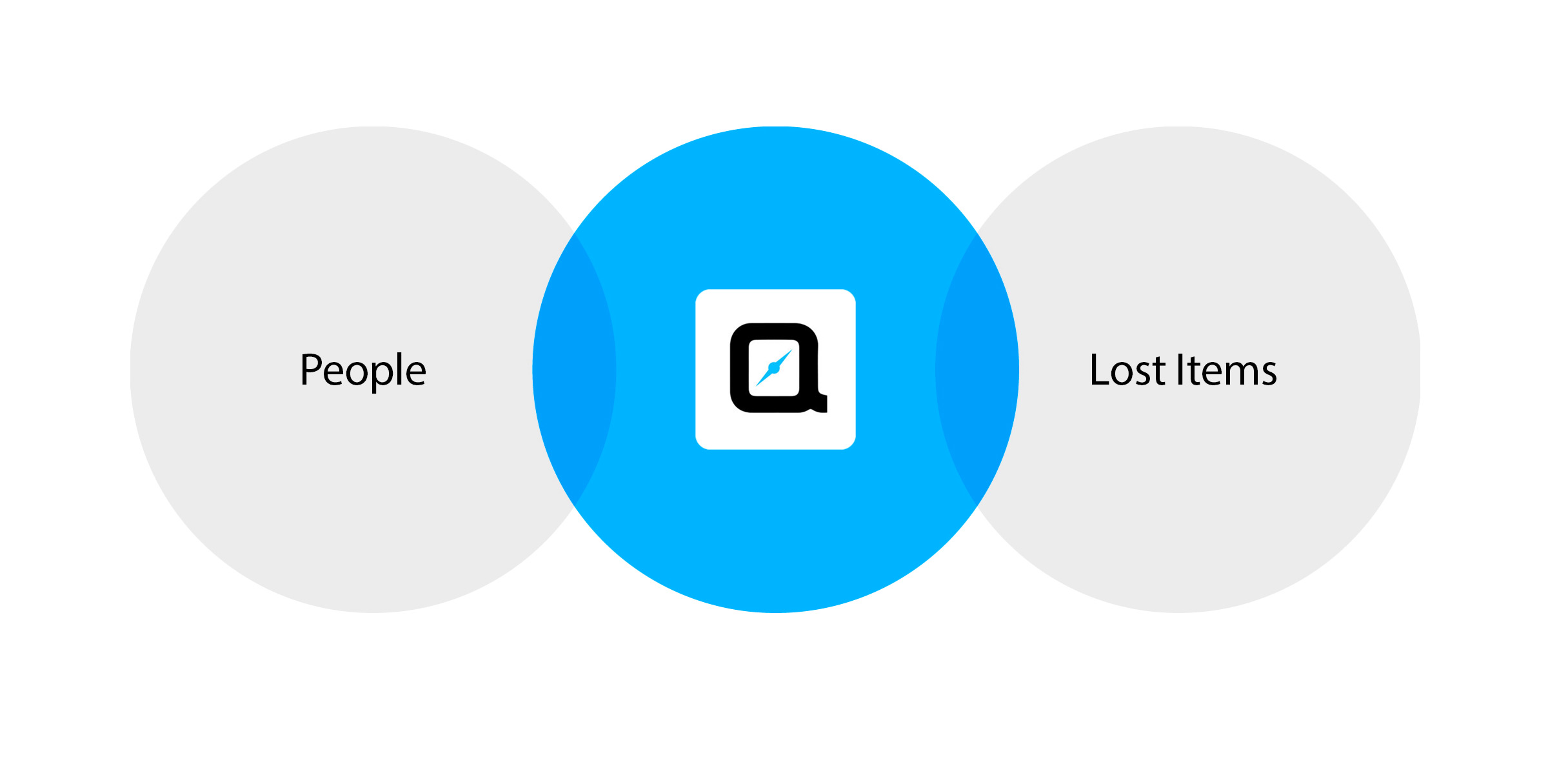
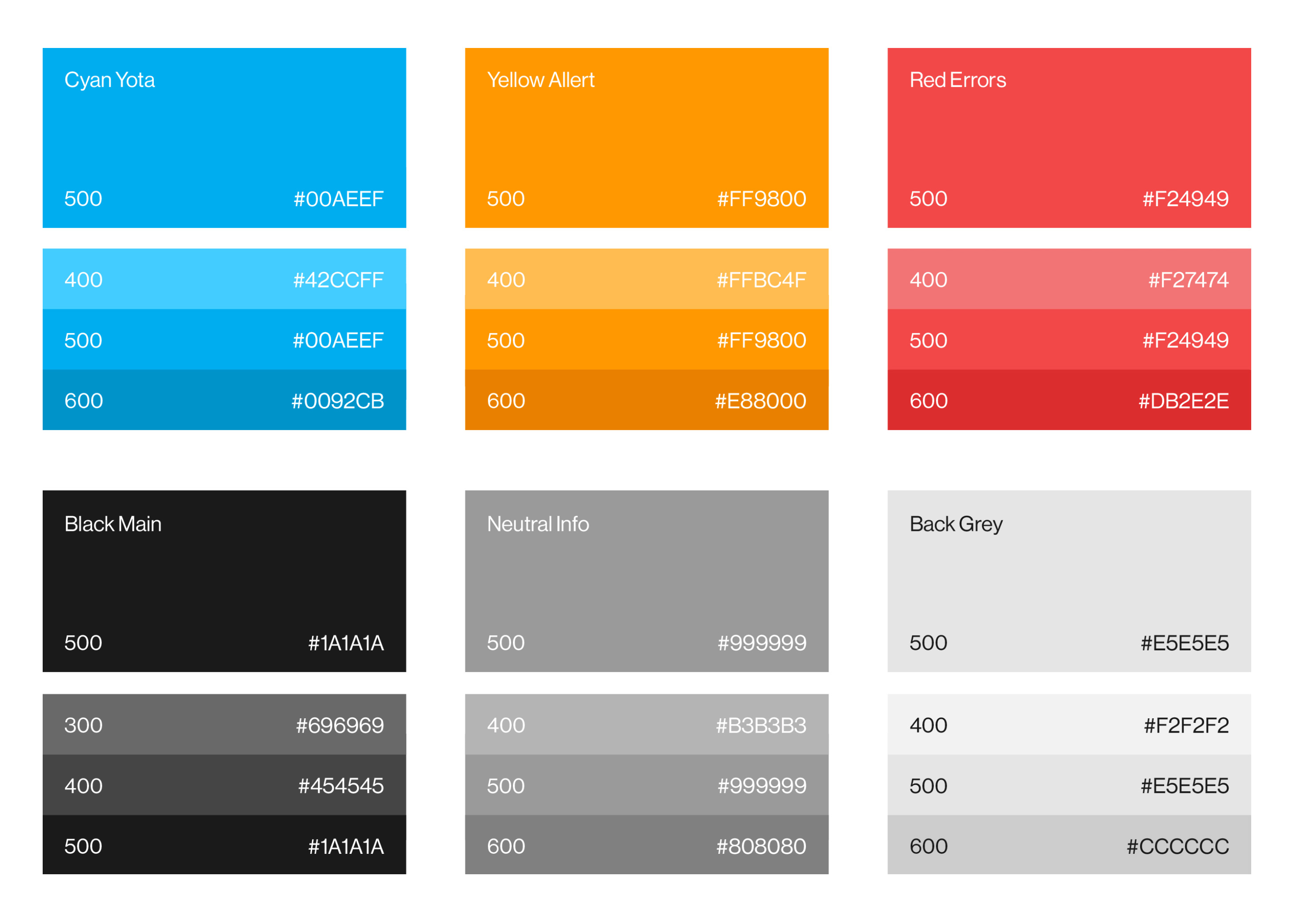
I set out to design the cleanest and simplest way to lead the user to the lost item. I only used color in the ui to invoke to the user that it is a actionable item and a directional item. With the introduction of a clean background will let the ui and directional colored waves easily communicate to the user in any lighting condition day or night.
Expertise
Mobile & Ux Design
Location Based Experience
Cloud Services
Design Process
Bridging the Gap
Trying to get a user to their lost item in one simple click was a very challenging task. Most competitor products, have many task to ask the user to do, for an example to require them to track the lost item via a map, then try to understand where they are on the map and how to get to the lost item.
Brand Identity
I wanted to design an app that closed followed the Material Design guidelines, but at the same time belonged to the Nonda family. We decided to combine Nonda’s iconic look with the bright, cheerful appearance. I couldn’t wait to apply its novel and purposeful iconography, animation, and interface design principles on a real project.
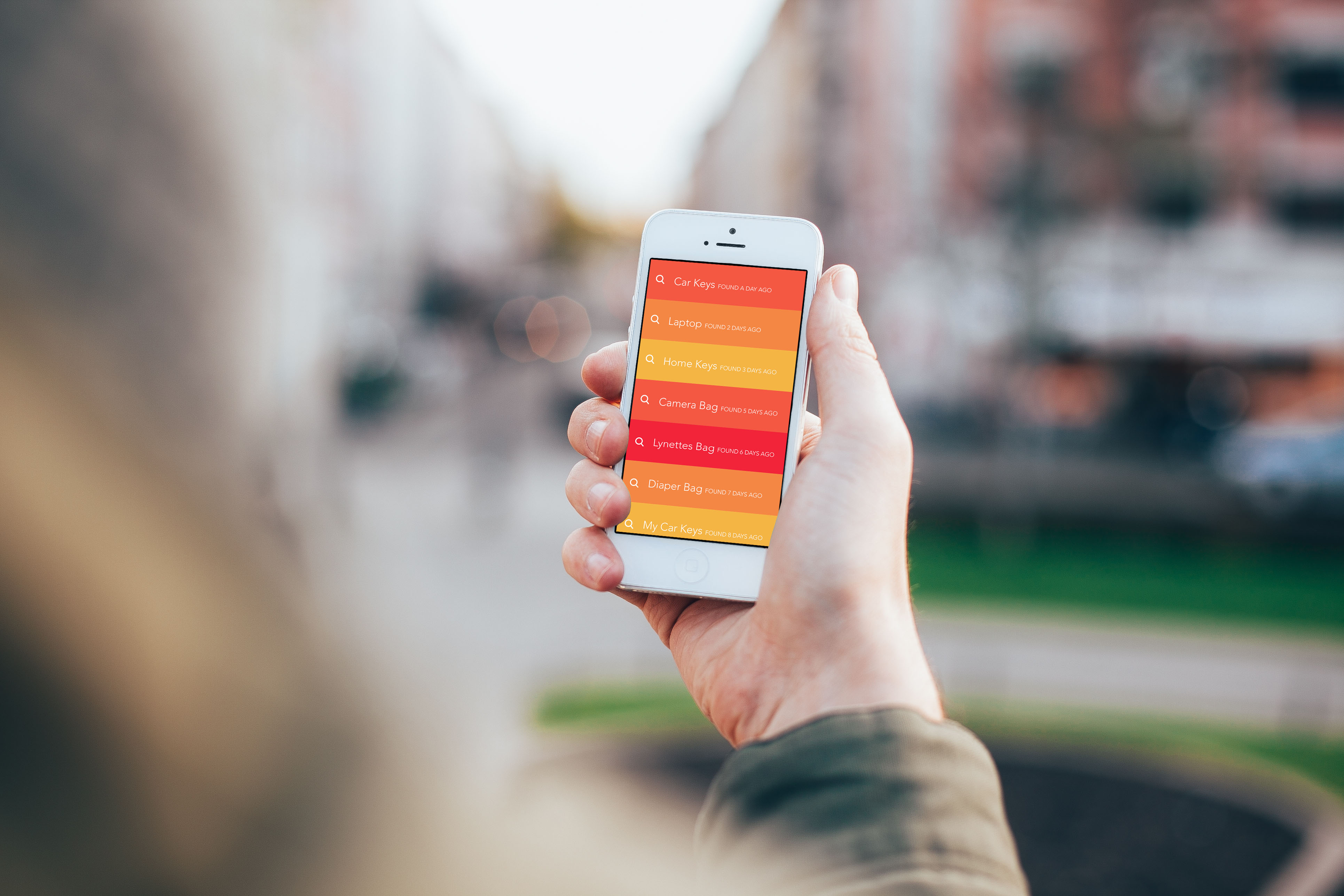
Action List Ui
Needed a quick and easy way to be able to view all your items linked to iHere. The user can just tap the item and will be brought into a guiding beacon pointing the path to walk and the distance to the lost item.
Related projects
Get in touch
Stay connected
Recent work