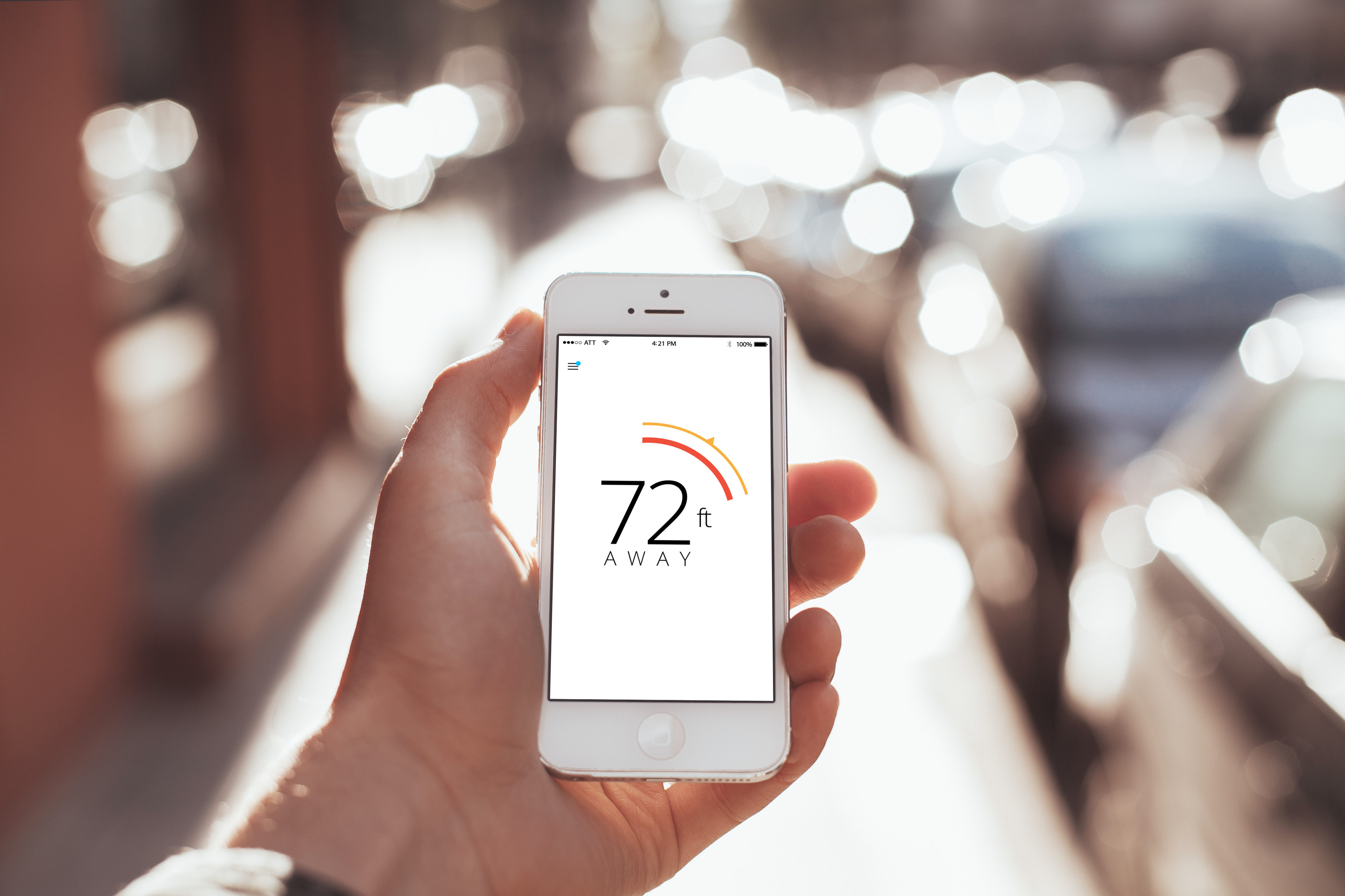
Problem
While Lytro Illum’s introduction to professional lightfield phototgraphy was revolutionary, the shipping interface and user experience was only evolutionary. How do we bring Illum 2.0 to market with a deserving user experience that addresses easy light field capture, modern user paradigms and a compelling playback experience.
Responsibilities
I was responsible for distilling the greatest leap in the advancement of photography in over 200 years into an intuitive, easy-to-use, user experience via not only embedded device UI, but also spanning and entire lytro living pictures ecosystem.
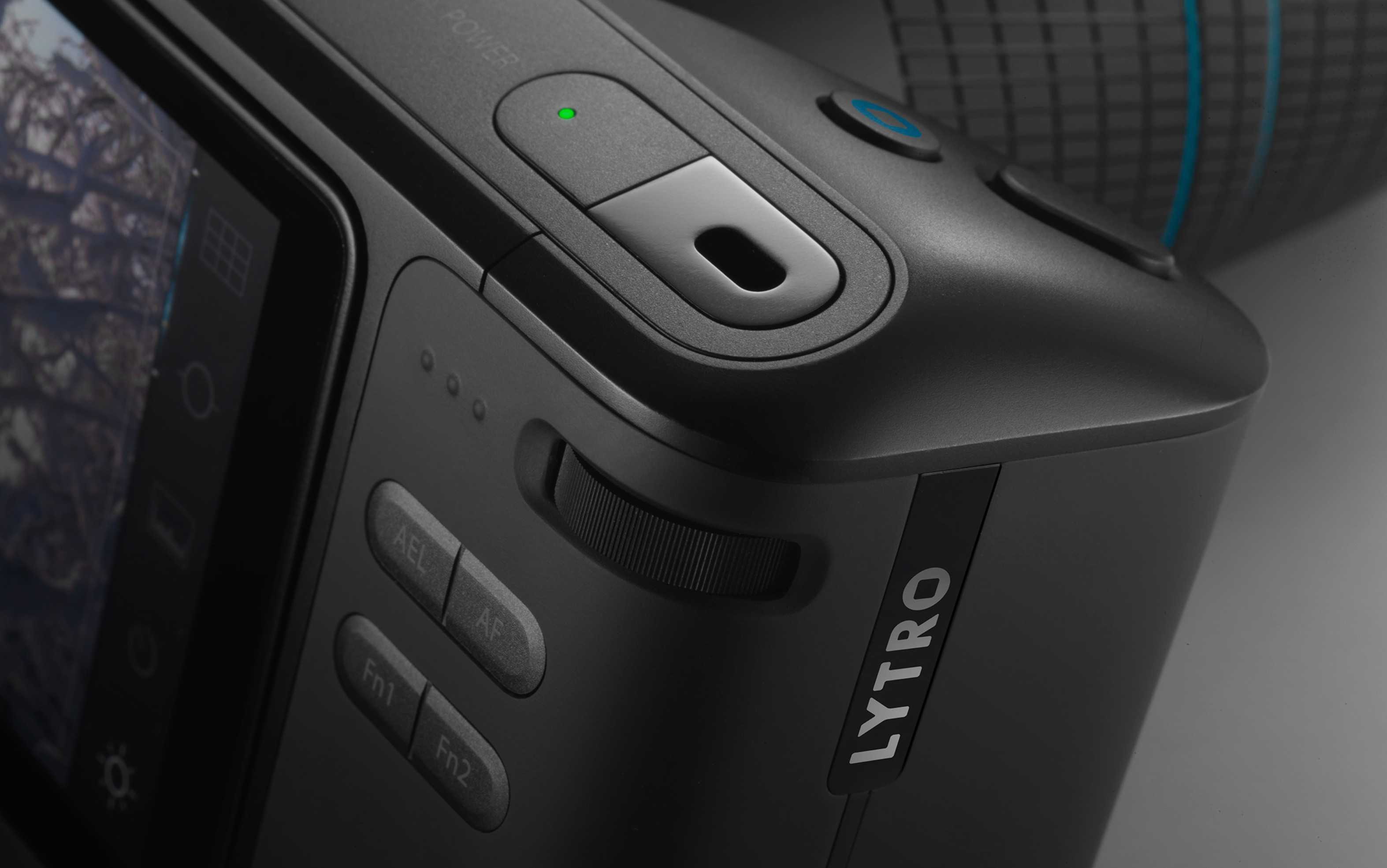
• With only a single prototype partner and a six week deadline, designed and prototyped, from the ground up, the next generation lytro light field camera ui/ux flow – from power on, to capture, preview and share
• Spearheaded and established a ui/ux design platform for all lytro branded hardware and software interfaces
• Collaborated and negotiated with camera engineering and product management stakeholders to ensure the lytro design platform was adopted, documented and championed throughout the lytro ecosystem
Expertise
Camera Ui
Strategy
Visual Design
Platform Design
Android
iOS
Project highlights
The Process
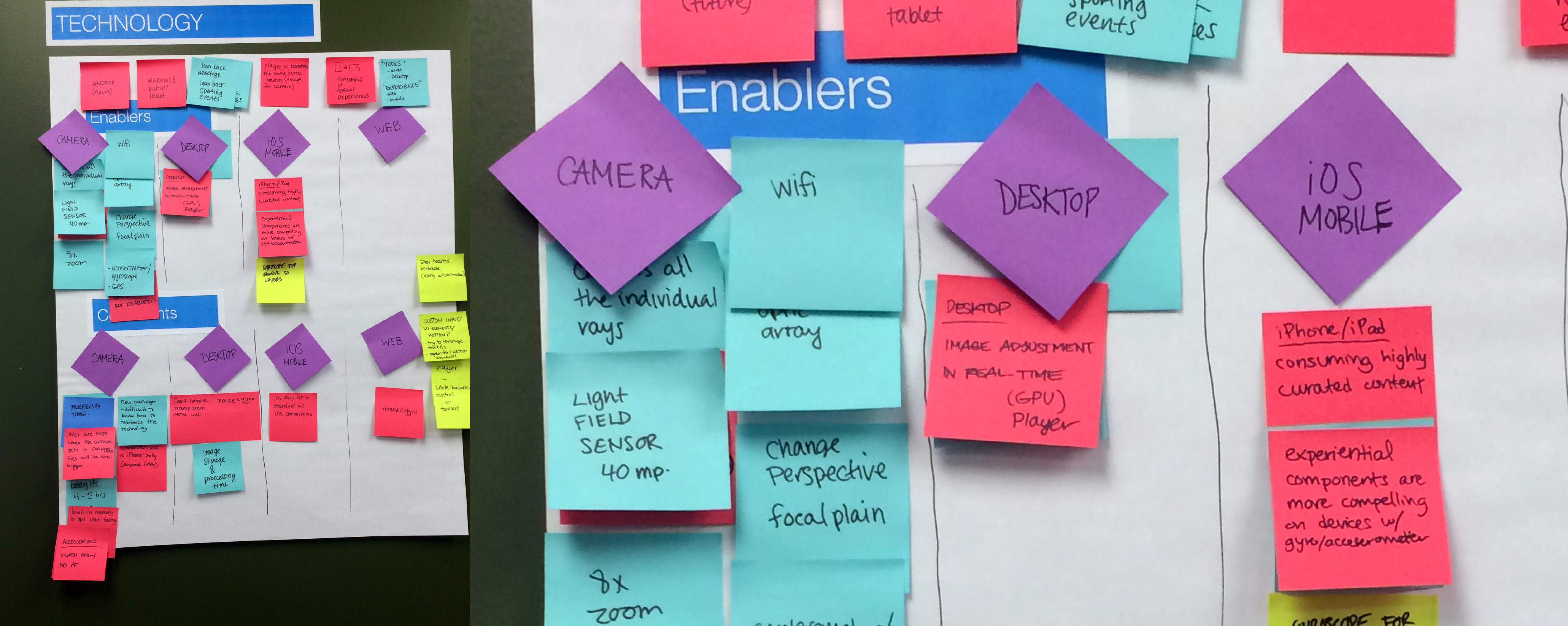
We did many discussions about things we where trying to get from the new ui we where going to plan out. We made a wish list of user interactions and mapped out user-flows. From theses items we where able to then place them into a working and living document which was shared into our development teams, so they can get a head start on creating the backend and front-end services for the ui & platform.

Ideation
This was one of many design directions where explored and we quickly moved onto another direction, because we feared having a ui which was primarily white based would intrude on the photographers eye and the ui would feel a bit stressful.
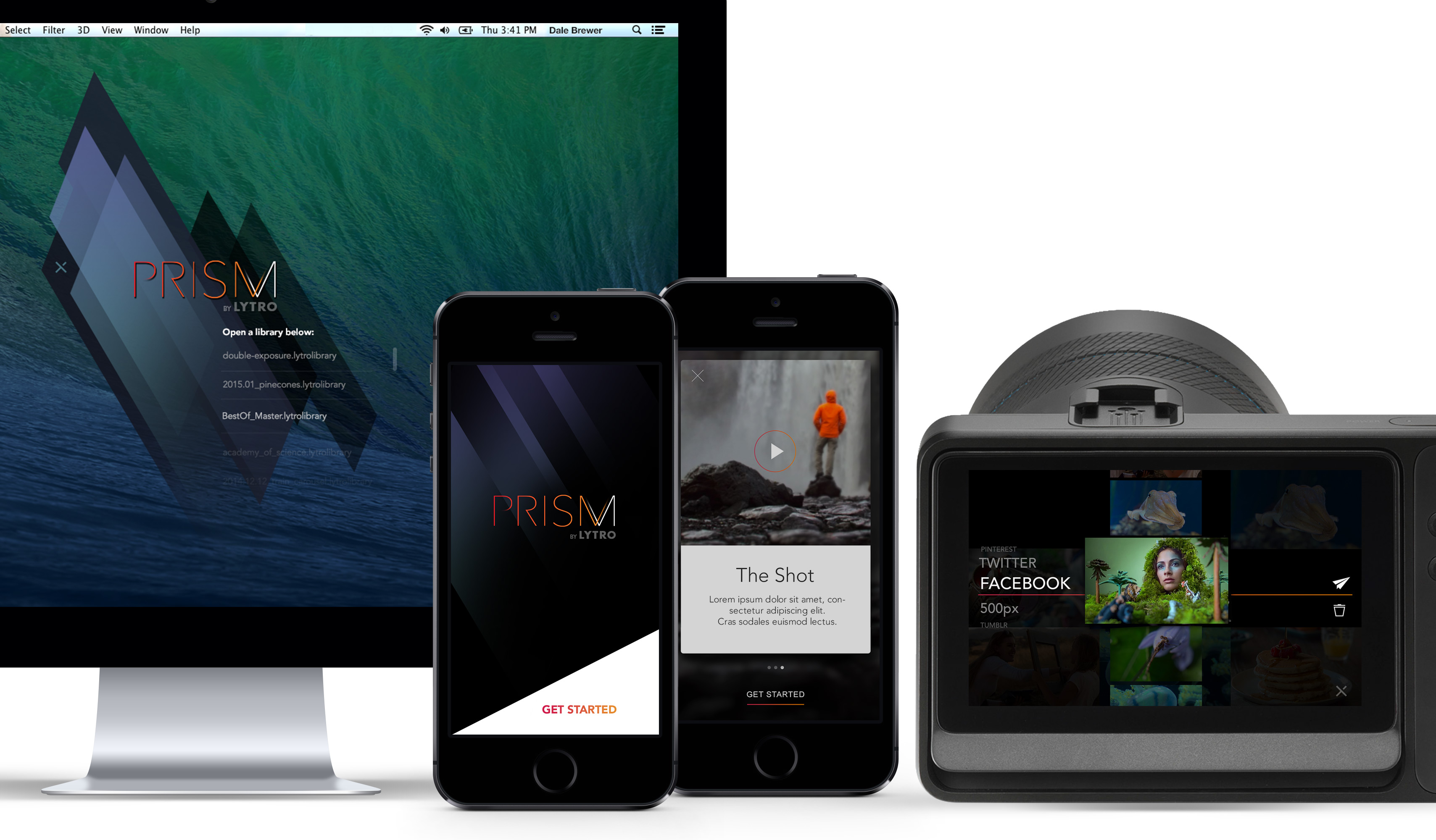
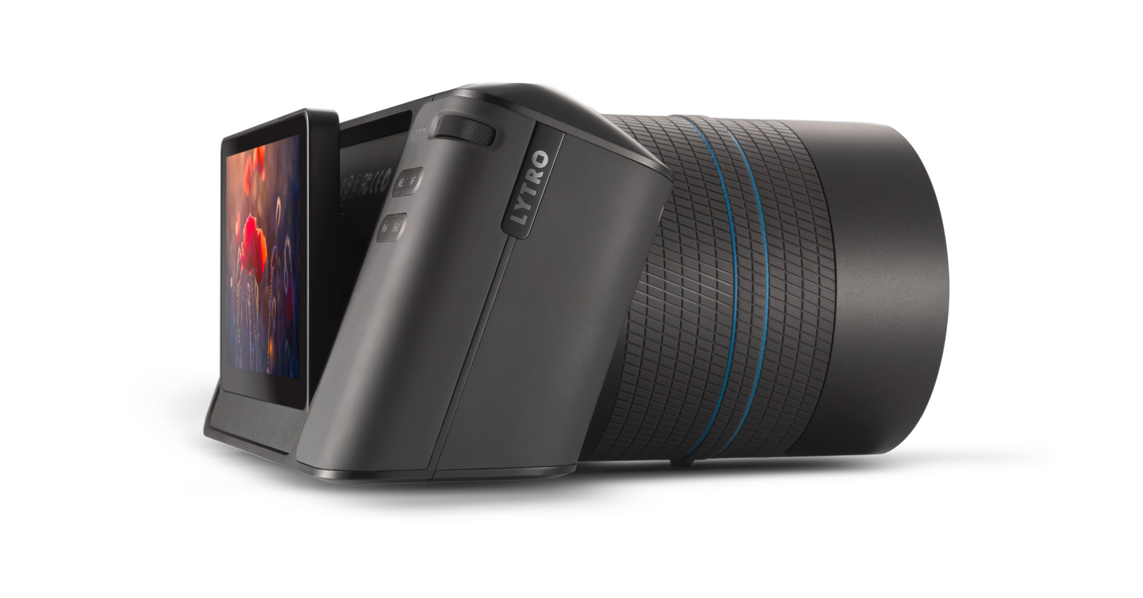
The Solution
I finally landed on a direction which is based with little to no “chrome” which I tagged as “chrome-less ui.” Where the ui lays over the screen with no white or grey chrome, but to allow the ui to be more contextual based on the photographers needs and let them navigate with a mobile approach than a standard DSLR.
Project numbers
Beers & Tears
Cups of Coffee consumed
Design Changes
Tracks of Daft Punk
Related projects
Get in touch
Stay connected
Recent work